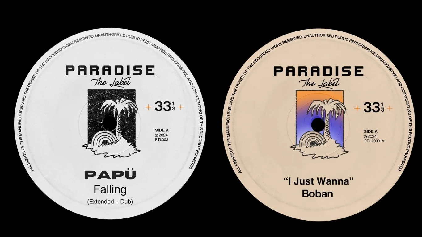
Paradise The Label is an independent New York based record label working with emerging artists.
I developed its visual identity, from the logo to vinyl cover artwork, and established a flexible visual framework to give new artist releases their own character while keeping the label’s overall look cohesive.
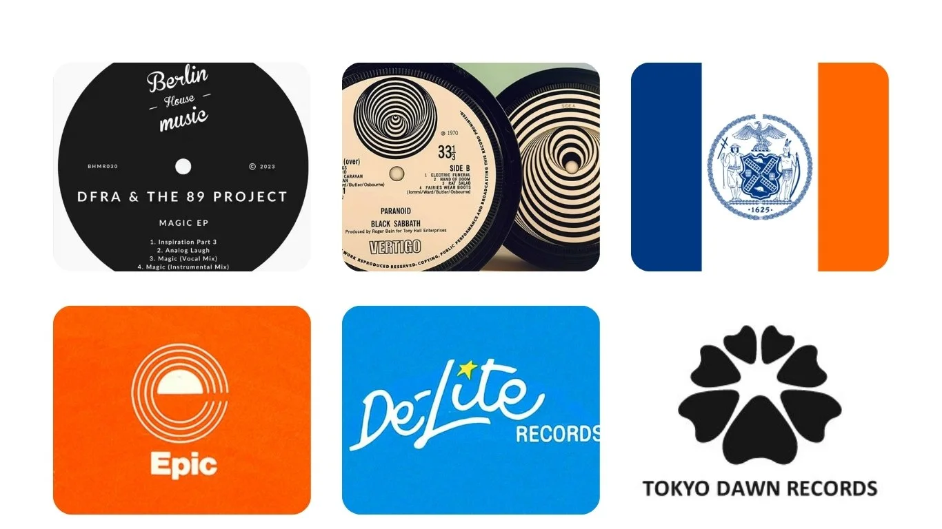
Moodboard
Previous logo iterations
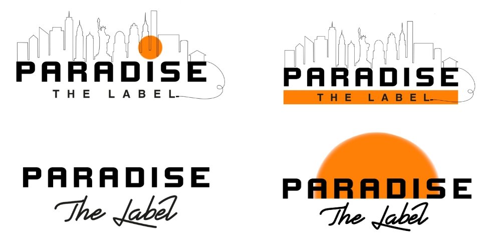

The logo shown above was selected over the version featuring the orange sphere. While the orange sphere was initially favoured due to its reference to the New York City flag, it was later recognised that it closely resembled the identity of another label, Paradise Ibiza. As a result, the logo above was chosen.
Illustrative Logo
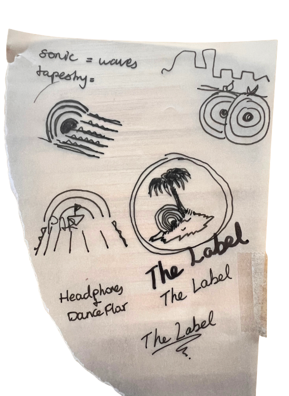


The palm tree and island immediately evoke the idea of paradise, while the vinyl emerging from the sand suggests music as a hidden gem waiting to be discovered.